
A case study in range branding: How we created a textbook range for The Wine Society
The Wine Society is one of the most trusted and respected wine retailers, and Barlow & Co. were tasked with refreshing and relaunching The Society’s range of best-loved bottles.
The wines labelled as The Society’s are those that the buyers spend the most time sourcing, and often blending, with their producers, to get them just right.
Harpers Design Awards 2023
Trophy Winner ‘Best Redesign’


The brief was to redesign and update The Wine Society’s own-brand range of wines, to create a distinctive visual identity that would be more closely unified across the range, and that Wine Society members would be proud of having a bottle of Society wine on the table.
Barlow & Co. explored the concept of a library, or a collection of published editions. Each label has a unique illustration that references the region, winemaker or character of the wine to create a ‘textbook’ wine label.
From the gnarled vines of Lodi in California to the perfect match of White Burgundy and fish, the images have characterful links to the wine style and region. Sourced from vintage image libraries and archives, they become icons for each bottle.
“These are the most important wines in our range.”
thewinesociety.com


The designs are flexible so they can work across over 50 different styles of wine, bottle shapes and label sizes.
It was imperative that the labels are instantly recognisable as ‘Society wines’ through brand typefaces, colour, logo and illustration.
The typography on each label is created from a selected family of brand fonts, and a limited colour palette of black and ‘Wine Society Red’ helps unify the range and allows customers to easily spot the wines they can trust.
90+ wines
The Society’s range currently includes more than 90 products from over 17 countries.

An important aim of the project was to reduce and eliminate excessive packaging.
Each label is printed in just two colours with no finishes and The Society’s Claret – their top-selling wine – no longer has a foil capsule. New packaging formats, including boxed wine and a ‘flat’ bottle made from PET recycled plastic are part the of the range.
What we did
— Competitor audit
— Brand design and assets
— Creative label concepts
— Artwork and production

Previous label designs

New label designs for The Society’s Own Range
More case studies
-
![Tesco Finest case study]()
How we gave Tesco Finest wines a hallmark of quality across the range
-
![]()
How we helped The Drinks Trust create positive ripples in water
-
![Brand design for McGuigan Zero wines – the UK’s number one non-alcoholic still wine]()
Proudly McGuigan, globally recognisable, unashamedly alcohol-free
-
![]()
Creating a contemporary identity for Bluebell Vineyard Estates
-
![]()
Evolving Blackwoods Gin & Vodka - spirits with a Scottish accent
-
![IGO organic rosé wine]()
Creating the first canned Spanish rosé for Pol Roger
-
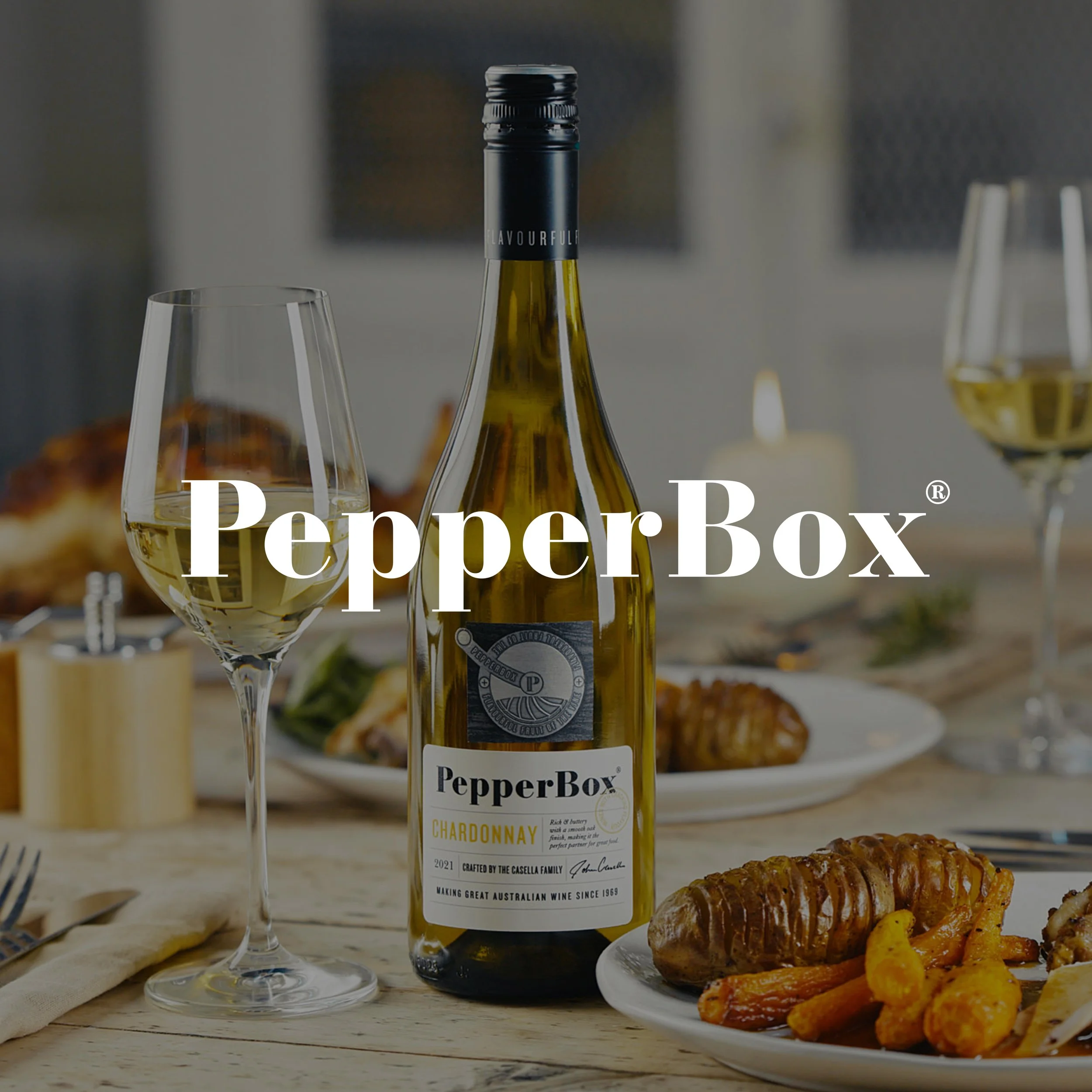
![PepperBox case study]()
How we created a new wine brand with cracking flavour