A case study in brand and label design: how Blackwoods spirits rediscovered their authentic Scottish accent
Distil were looking to reposition and redesign Blackwoods in a way that retained the brand’s essence but would also shape their future direction. Barlow & Co. developed a strategic direction that focused on Blackwoods’ heritage as ‘the authentic Scottish spirit’.

Our brief from Distil was to audit their brand and market positioning, and to add differentiation from their competitors in order to strengthen and widen their customer appeal.
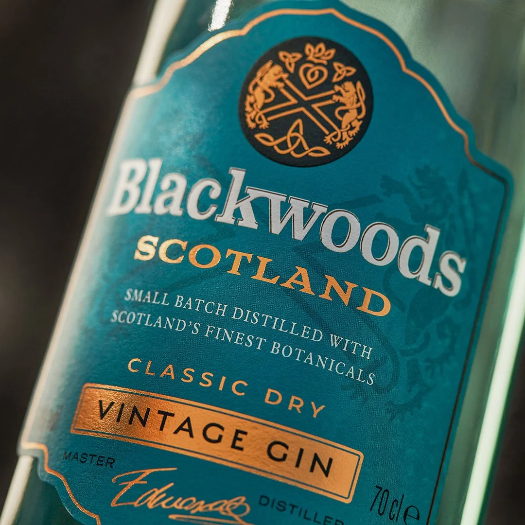
Our brand design team focussed on Blackwood’s Scottish heritage and character – authentic, natural and classic, but with a contemporary edge.

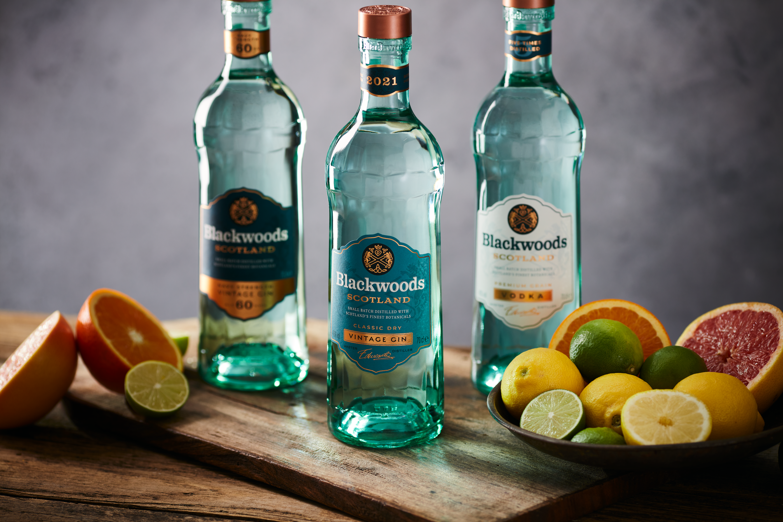
The Blackwoods spirits label design is inspired by the landscape surrounding their Scottish distillery, and the outstanding botanicals on their doorstep.
The core Blackwoods gin is a classic London Dry gin with a bright citrus twist, with the addition of unique Scottish botanicals to represent the year in which it's made.
The use of teal, a bright and recognisable accent colour, evokes the distillery’s coastal origins. Copper was used to add premium detailing and warmth.
What we did
— Brand positioning
— Range planning and strategy
— Visual identity and guidelines
— Label and packaging design
— Artwork and production

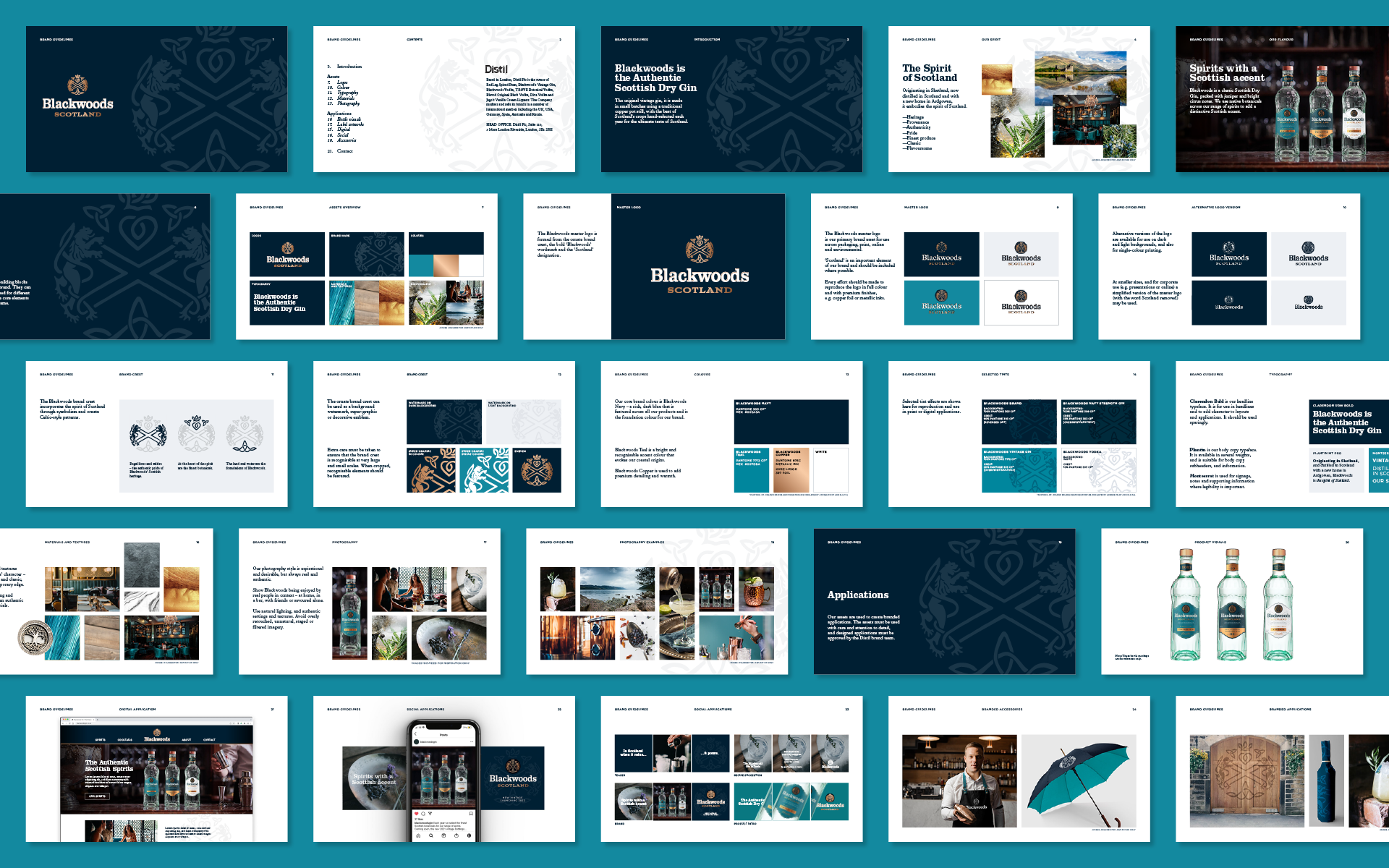
As part of the strategic repositioning, Barlow & Co. developed a 360 guidelines document that outlines Blackwoods’ heritage as ‘the authentic Scottish spirit’.
The 360 document includes guidelines for brand assets including logo, colour, pattern and typography, as well as ‘look-and-feel’ applications for digital, social and environmental media.


While designing the spirit label, we also needed to incorporate a second gin and vodka that worked cohesively as a range, while having stand-out appeal in their respective categories.
A darker tone of teal was used for the Navy Strength Gin and a larger copper section (showing the alcohol strength) was added to aid clarity within the gin category for consumers.
The Premium Grain Vodka has a white label but incorporates teal and copper detailing, and the distinctive teal green bottle to connect it with the gins.
Environmentally conscious
the bottle is made from 52% recycled glass.
the cap is made from recycled ABS in a 100% renewable energy powered factory.
the label is printed on uncoated, wood-free, FSC certified paper.


More case studies
-
![Brand creation and design for Marks and Spencer Found wines M&S]()
How we journeyed off the beaten track for a new M&S range
-
![Creating Trust Water with The Drinks Trust - the first water brand to support the drinks industry]()
How we helped The Drinks Trust create positive ripples in water
-
![Brand design for McGuigan Zero wines – the UK’s number one non-alcoholic still wine]()
Proudly McGuigan, globally recognisable, unashamedly alcohol-free
-
![]()
Creating a contemporary identity for Bluebell Vineyard Estates
-
![IGO canned spanish rosé wine]()
Creating the first canned Spanish rosé for Pol Roger
-
![]()
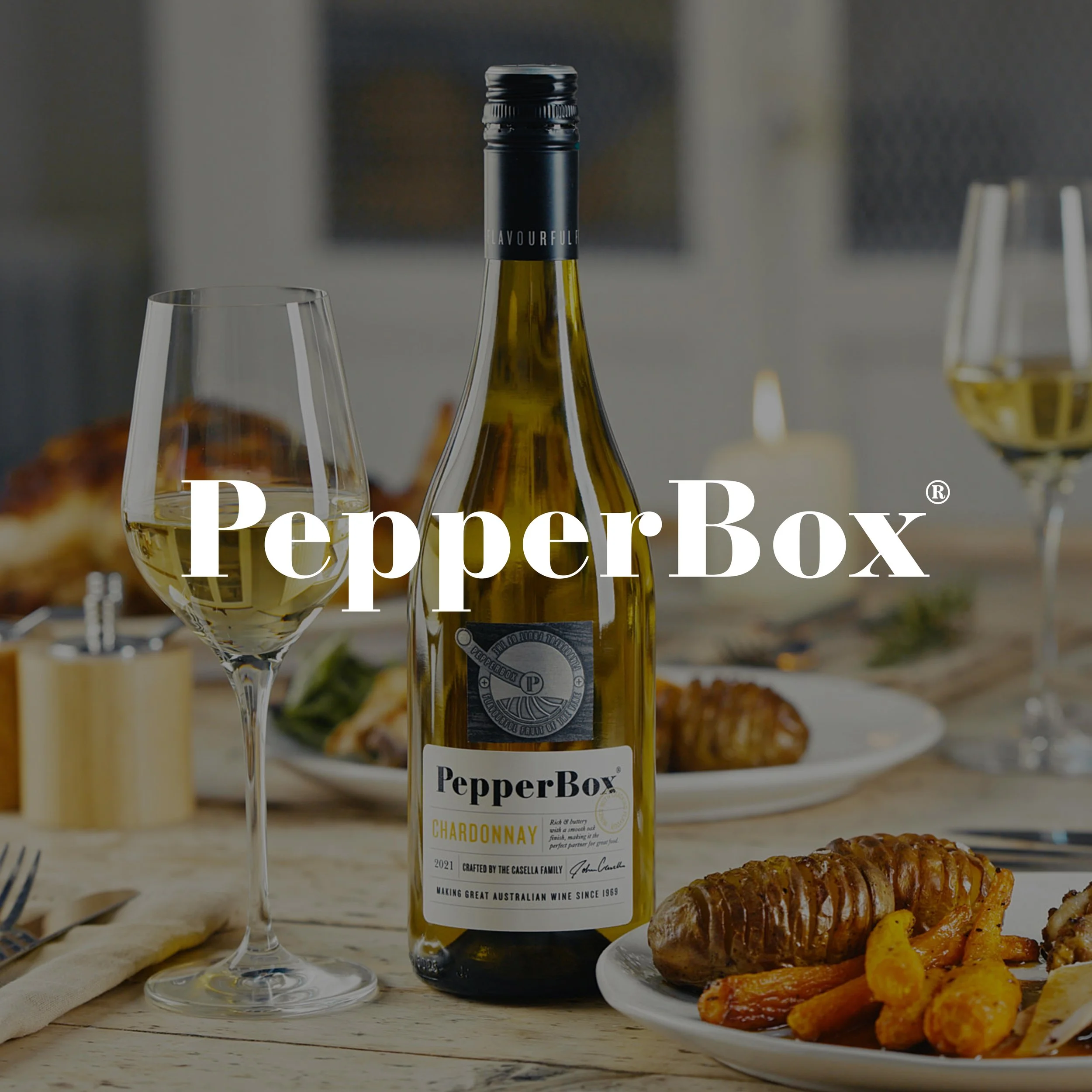
How we created a new wine brand with cracking flavour
-
![Tesco Finest case study]()
How we gave Tesco Finest wines a hallmark of quality
-
![Tesco Finest case study]()
How we gave Tesco Finest wines a hallmark of quality across the range