
Creating a brand icon: how we gave Journey’s End a unique identity across their ranges
Journey’s End is a showcase of South Africa’s most characterful and complex, well-crafted wines. Barlow & Co. partnered with Journey’s End to refresh their brand identity and ensure each range of wines has its own unique character, from entry-level to the premier tier.
1995
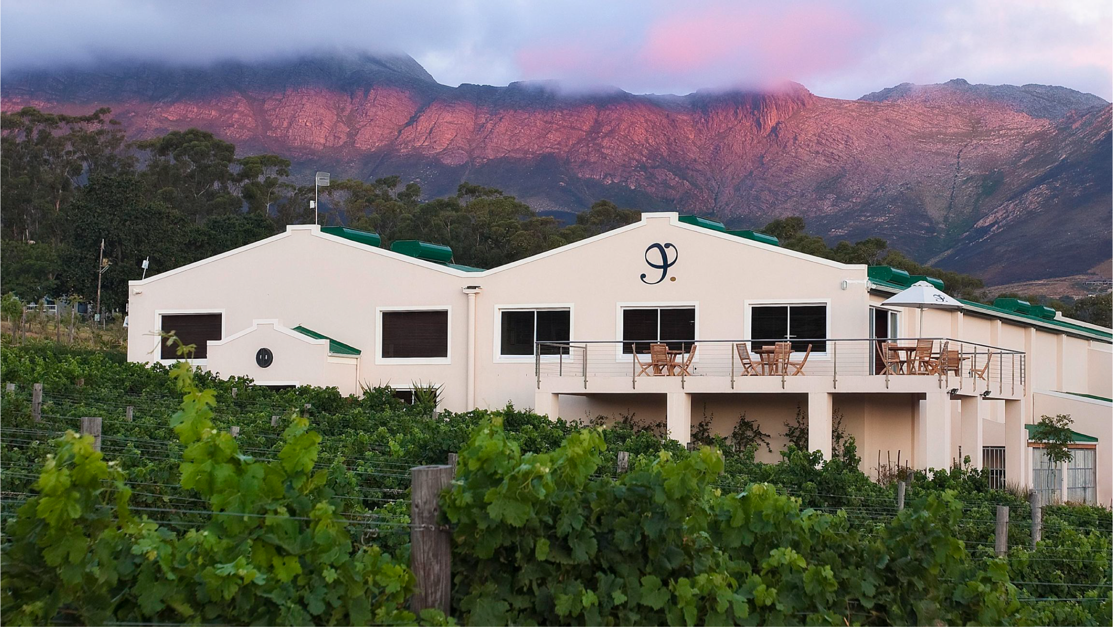
Founded by the Gabb family in 1995, Journey’s End have been producing wine for nearly three decades.
Barlow & Co. refreshed the Journey’s End brand icon, evolving their look to a cleaner, more modern and fresh aesthetic.
The logomark has been refined with a circular full stop and overall curvature so it feels both classic and sophisticated; modern and finessed. It is an esteemed symbol of the brand it represents and is featured on all the Journey’s End bottle capsules.

“The Journey’s End range of wines is split into three tiers, each with their own character. We recently decided to revamp all three wine series – Tales Series, V Series and Precision Series – with creative new packaging to give clearer differentiation between the three tiers and to better reflect the character of Journey’s End, our team and our wines – we’re always pushing boundaries, being forward-thinking, innovative and somewhat quirky.”
Rollo Gabb
Working closely with founder Rollo Gabb and the team in Stellenbosch, Barlow & Co. have crafted designs for each tier, highlighting what makes each selection of wine special.
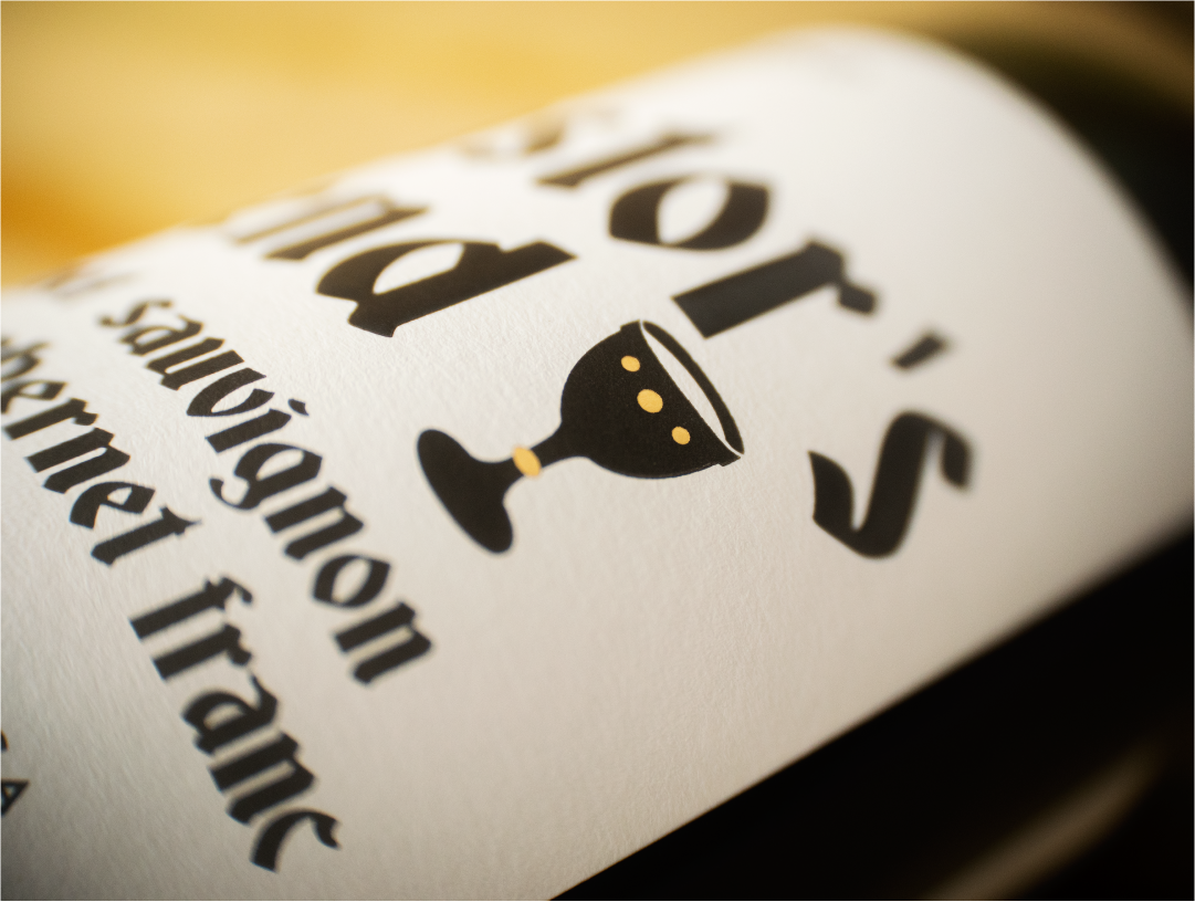
The ‘Precision’ range is the ultimate destination for South Africa’s premium wines. Top quality single vineyards and regions, combined with the expertise of Journey’s End winemakers, Leon Esterhuizen and Mike Dawson.
The designs for the top tier Precision range perfectly encapsulate this – beautiful, refined, and utterly chic. The simplicity of the labels truly allows the wines to express themselves, with elegant script fonts and accents of varnish and gold foil.


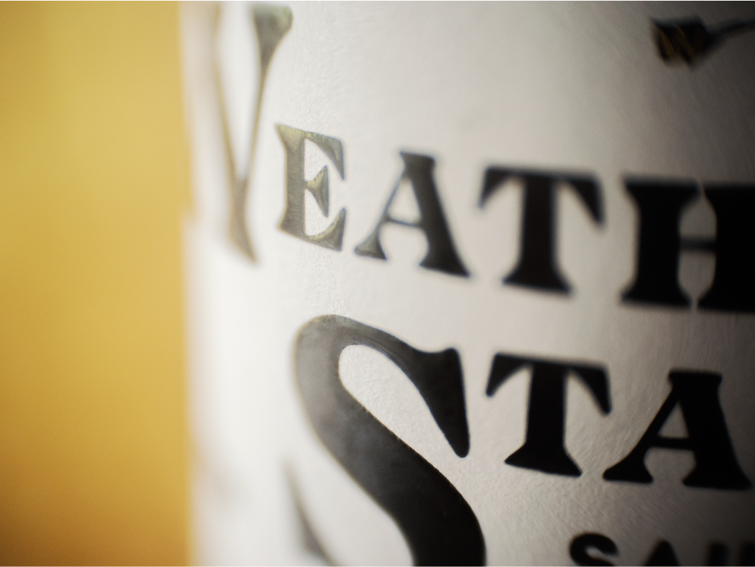
At a mid-tier level, the Journeys End ‘V Series’ brand takes the spotlight.
For Barlow & Co. this was about championing the brand, front and centre, with fine details to elicit the quality inside. Featuring crisp, clean typography for the vintage, region and number of barrels produced, each endorsed by the winemaker's signature. And a small, gold numbered ‘V’ – a nod to each varietal and edition in the collection.


For the ‘Tales’ series of wines, we took a journey into the winelands of Stellenbosch.
A destination for beautiful wine-making and stories of the eclectic people and going-ons at the farm itself (the huntsman; the pastor; the resident barn owls; and biodynamic practices that Journey’s End keep). Each wine tells a different story. The spirit of each expressed through characterful and engaging type, with a simple black, white and gold palette.


And for the ‘Identity’ series of varietal wines, Barlow & Co. went beyond the label with augmented reality.
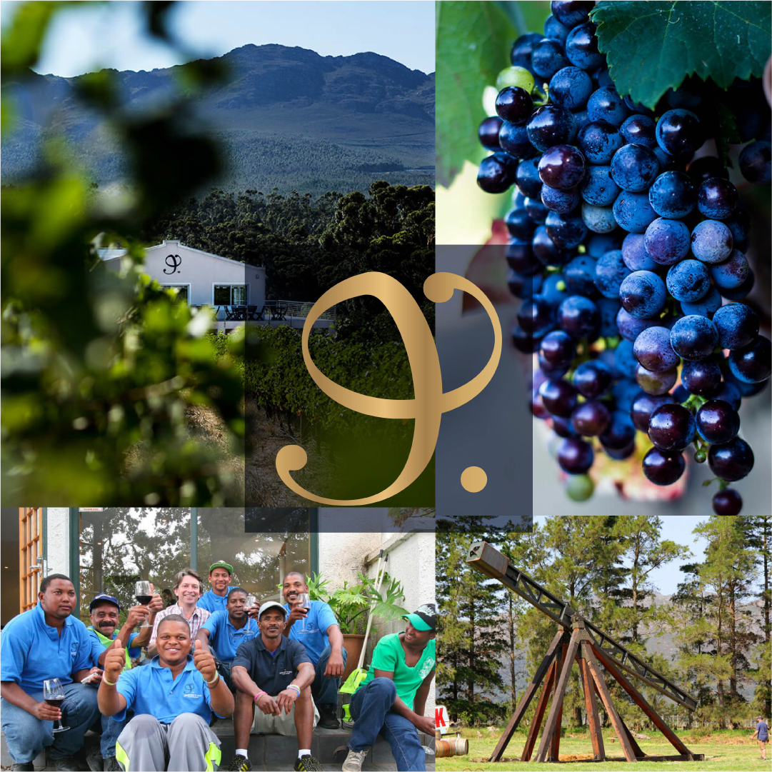
Barlow & Co. created a detailed collage illustration – including an image of Rollo’s famous trebuchet – to share the story of this sustainable, ethical and innovative vineyard. By looking after people and the planet, Identity strives to make a difference with their innovative approach extending into an augmented reality label that comes to life though a user app.
What we did
— Brand design and assets
— Creative label concepts
— Artwork and production


More case studies
-
![Brand design for Tesco FInest]()
How we gave Tesco Finest wines a hallmark of quality across the range
-
![]()
How we helped The Drinks Trust create positive ripples in water
-
![Brand design for McGuigan Zero wines – the UK’s number one non-alcoholic still wine]()
Proudly McGuigan, globally recognisable, unashamedly alcohol-free
-
![]()
Creating a contemporary identity for Bluebell Vineyard Estates
-
![]()
Evolving Blackwoods Gin & Vodka - spirits with a Scottish accent
-
![IGO organic rosé wine]()
Creating the first canned Spanish rosé for Pol Roger
-
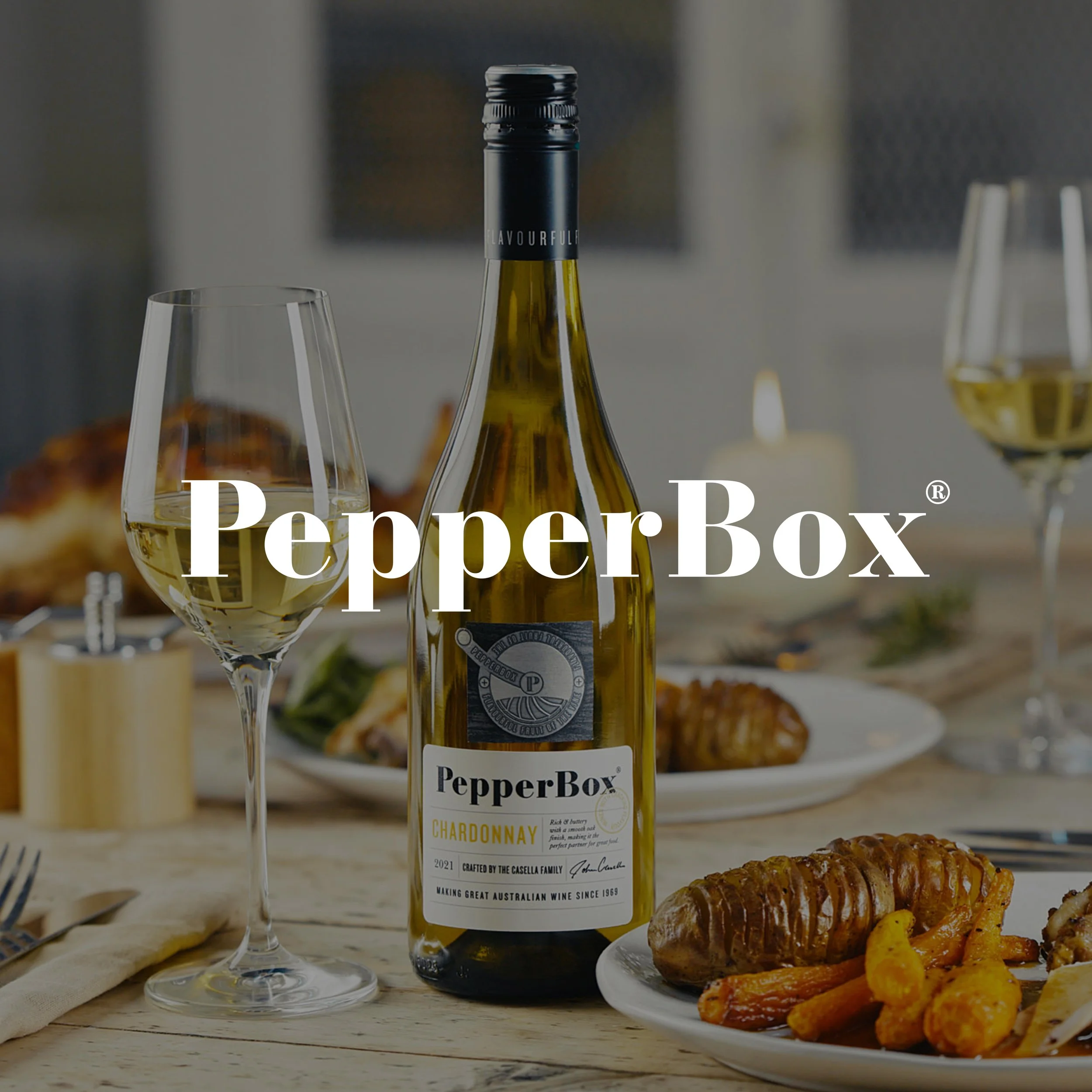
![PepperBox case study]()
How we created a new wine brand with cracking flavour