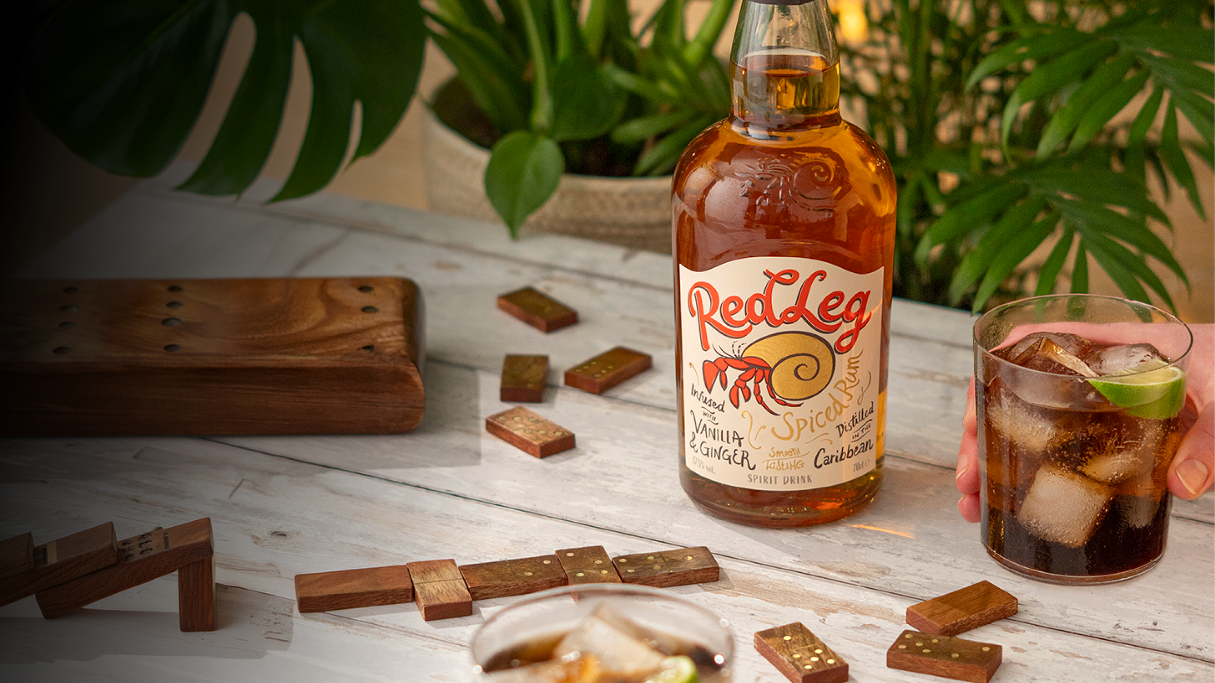
Capturing the spirit of RedLeg and bringing the brand out of its shell
Barlow & Co. refreshed the RedLeg logo and packaging of Distil’s flagship Spiced Rum to better communicate the brand’s Caribbean roots, celebrate the iconic crab icon, and improve stand out on-shelf.
The challenge
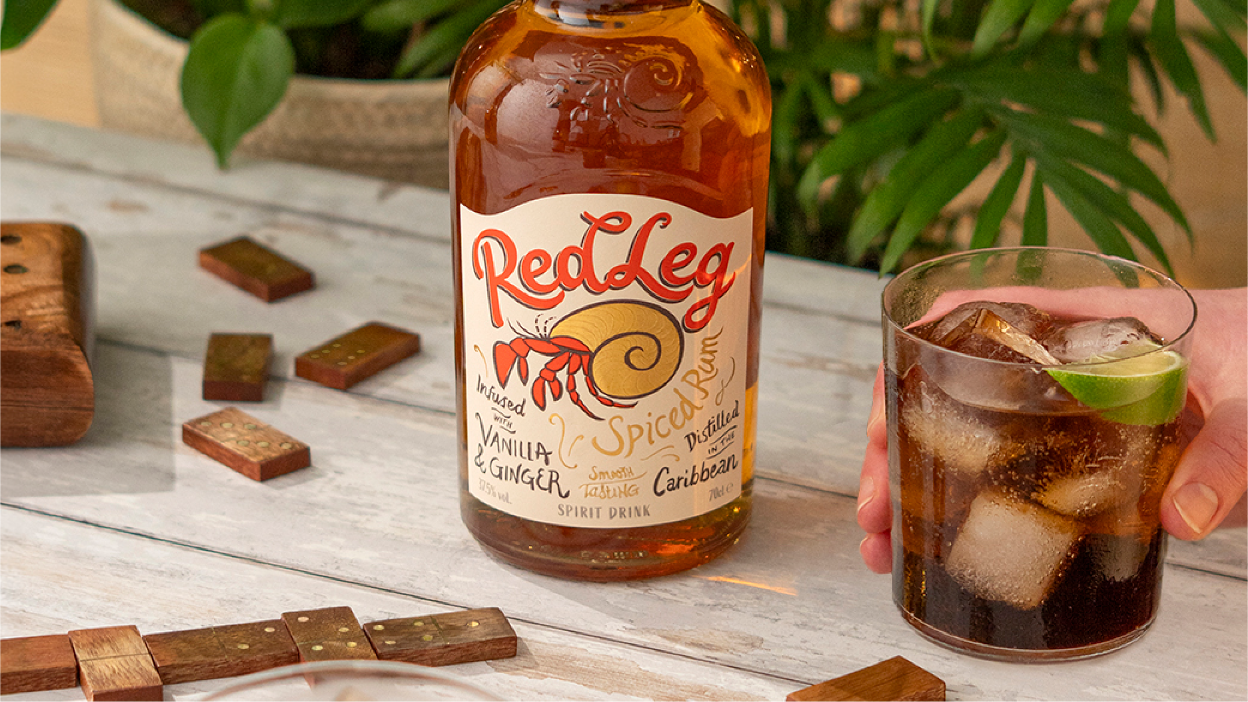
After ten years, the RedLeg brand was feeling tired, not effectively communicating its brand essence and the off-pack brand assets were difficult to use.
There was a new challenge - with spirit bottles sold in wire security cages in retailers - the dark RedLeg label was struggling to stand out on-shelf.
What we did
— Logomark refresh
— Label and packaging design
— Artwork and production
— Visual guidelines
“RedLeg is the best-tasting authentically-Caribbean Spiced Rum and embodies the IRIE ‘everything will be alright’ attitude.”
RedLeg Brand Positioning
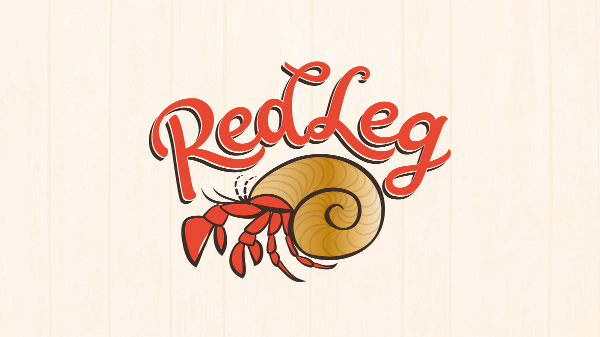
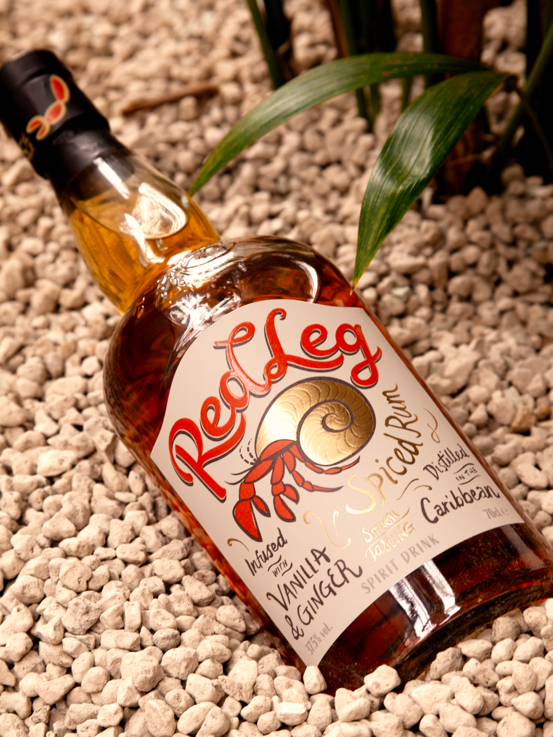
Celebrating an icon
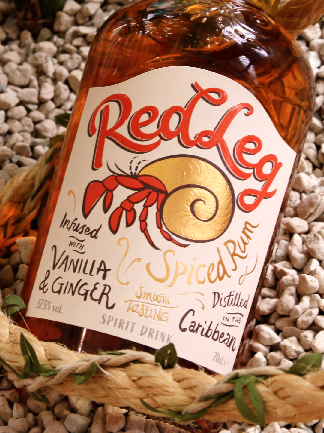
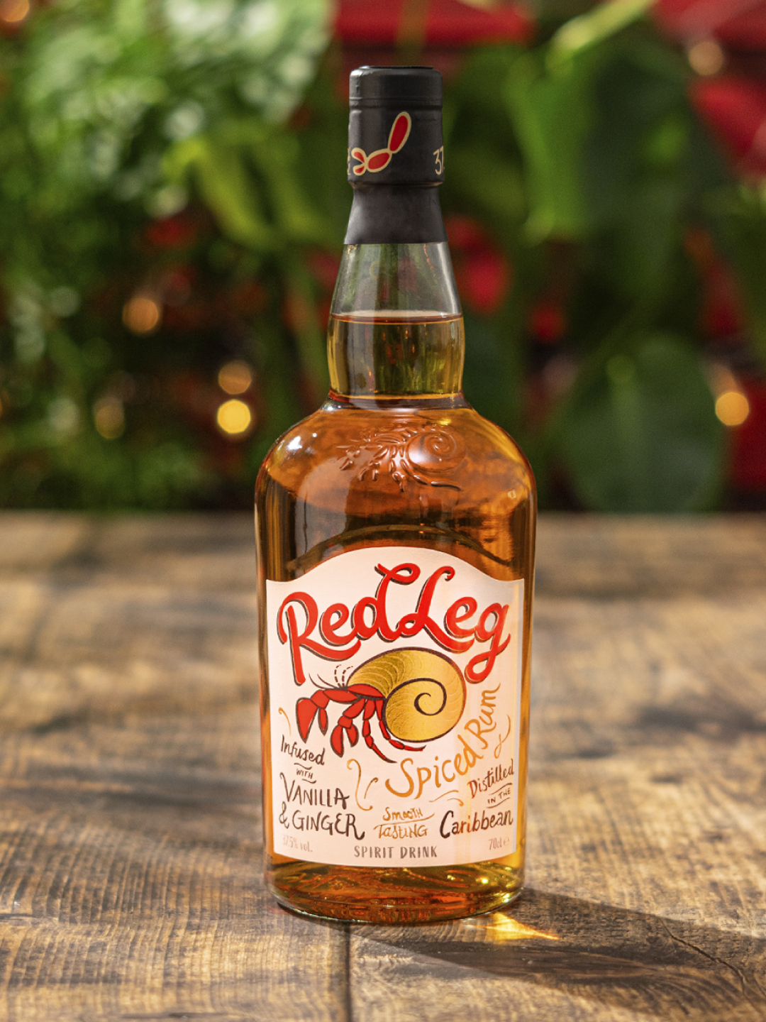
Named after the red leg hermit crab, moving from one found shell to the next, this Caribbean native embodies the ‘irie’ spirit of laid-back island life.
We updated the crab icon to be more recognisable, emphasising the crab’s red legs and adding gold to the shell for a premium finish.
A standout contribution
We made the bold suggestion to change the RedLeg label from a dark brown to a brighter warm cream, and use a bright red for the RedLeg brand colour, to improve shelf standout.
Barlow & Co. redrew the RedLeg wordmark, taking inspiration from Caribbean hand-lettered signage, softening the curves for a smooth, laid-back feel.

Delicious details
The RedLeg crab was finished in warm gold foil, with a gloss high-build varnish to add texture to the surface ridges of the shell, and create a gloss paint effect on the RedLeg wordmark.
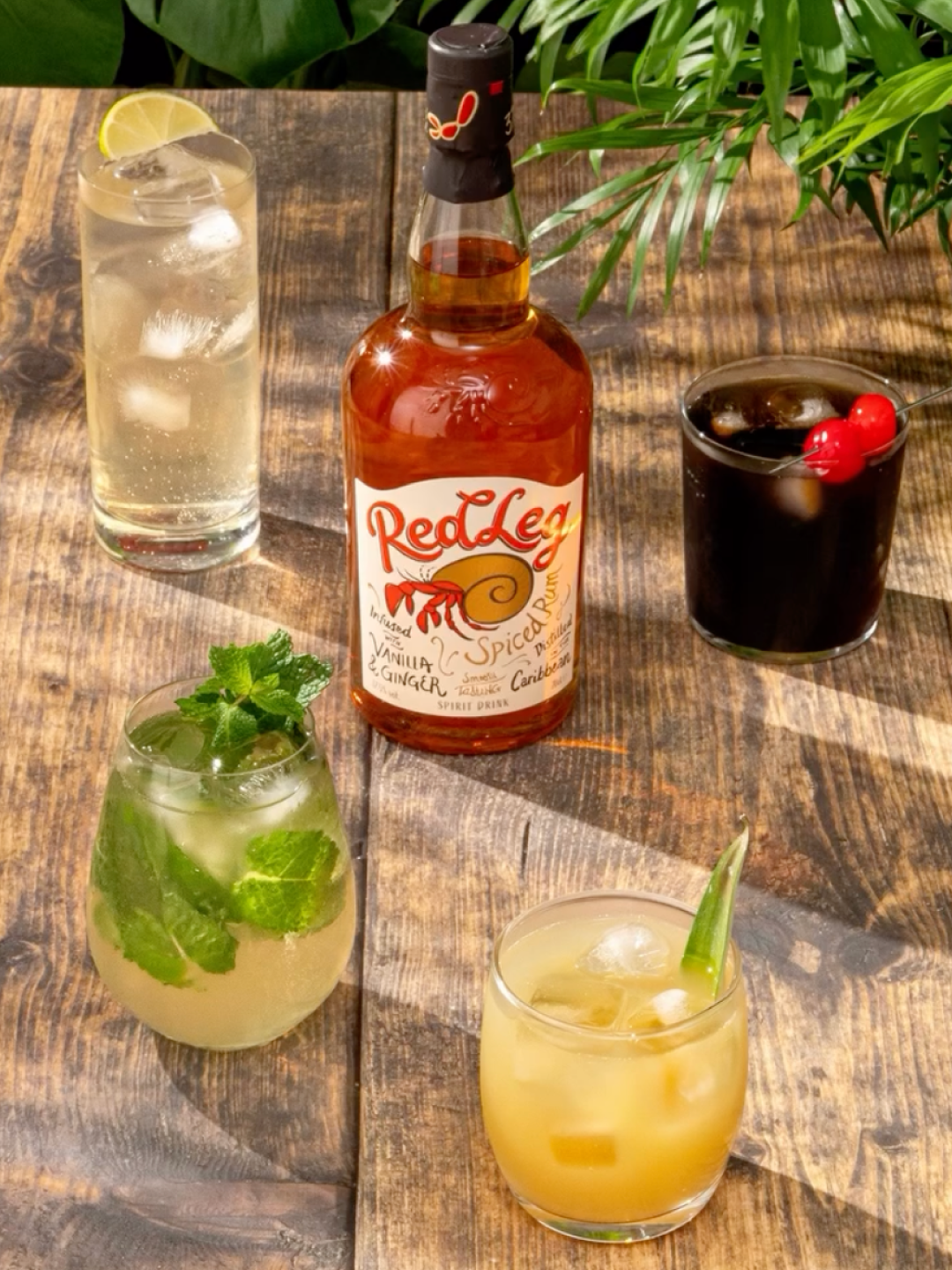
The updated brand launched with RedLeg Spiced Rum with updated flavour variants to follow.
More case studies
-
![Brand creation and design for Marks and Spencer Found wines M&S]()
How we journeyed off the beaten track for a new M&S range
-
![Creating Trust Water with The Drinks Trust - the first water brand to support the drinks industry]()
How we helped The Drinks Trust create positive ripples in water
-
![Brand design for McGuigan Zero wines – the UK’s number one non-alcoholic still wine]()
Proudly McGuigan, globally recognisable, unashamedly alcohol-free
-
![]()
Creating a contemporary identity for Bluebell Vineyard Estates
-
![IGO canned spanish rosé wine]()
Creating the first canned Spanish rosé for Pol Roger
-
![]()
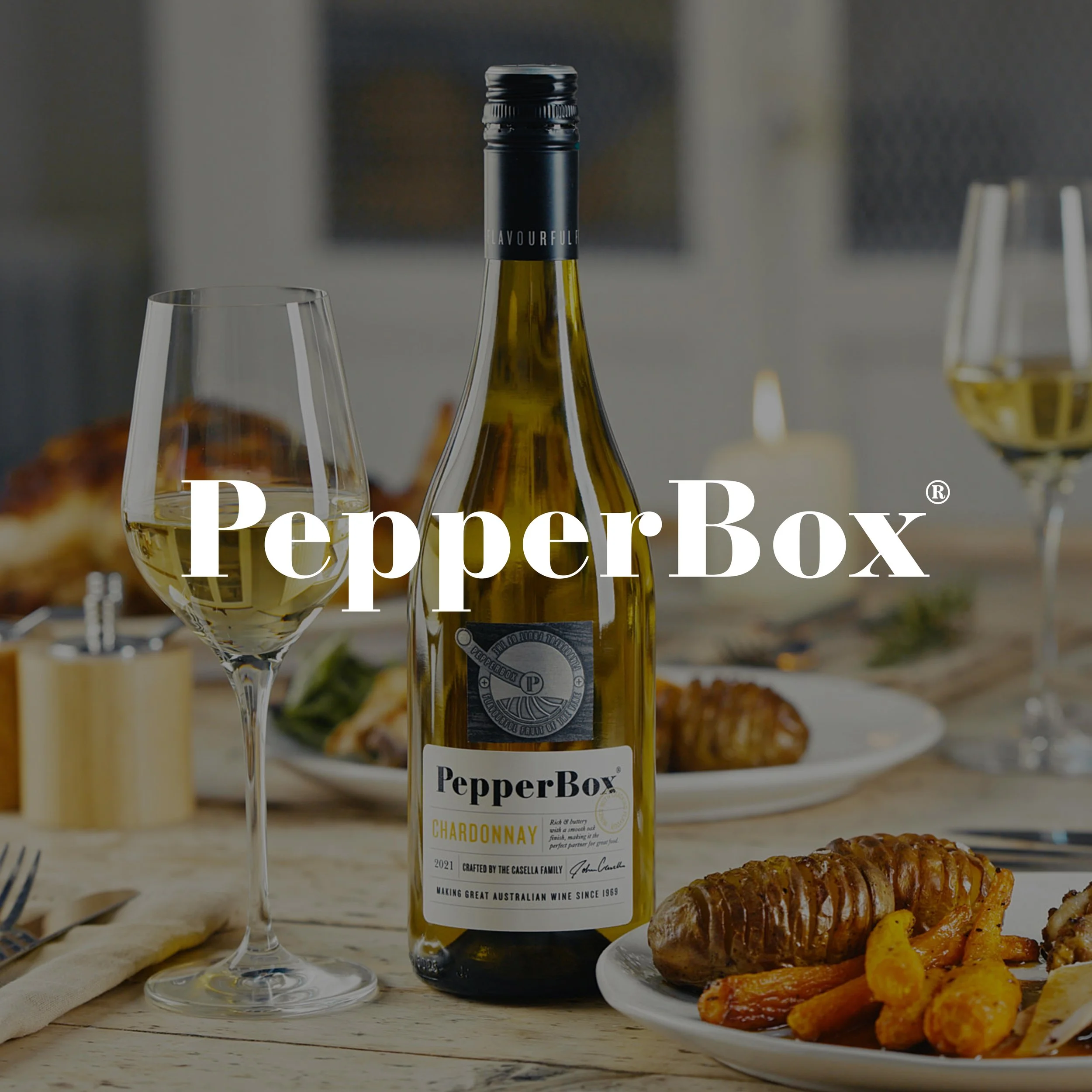
How we created a new wine brand with cracking flavour
-
![Tesco Finest case study]()
How we gave Tesco Finest wines a hallmark of quality
-
![Tesco Finest case study]()
How we gave Tesco Finest wines a hallmark of quality across the range