A case study in wine bottle label design: how we captured a family’s passion and history for a rising star in Pomerol
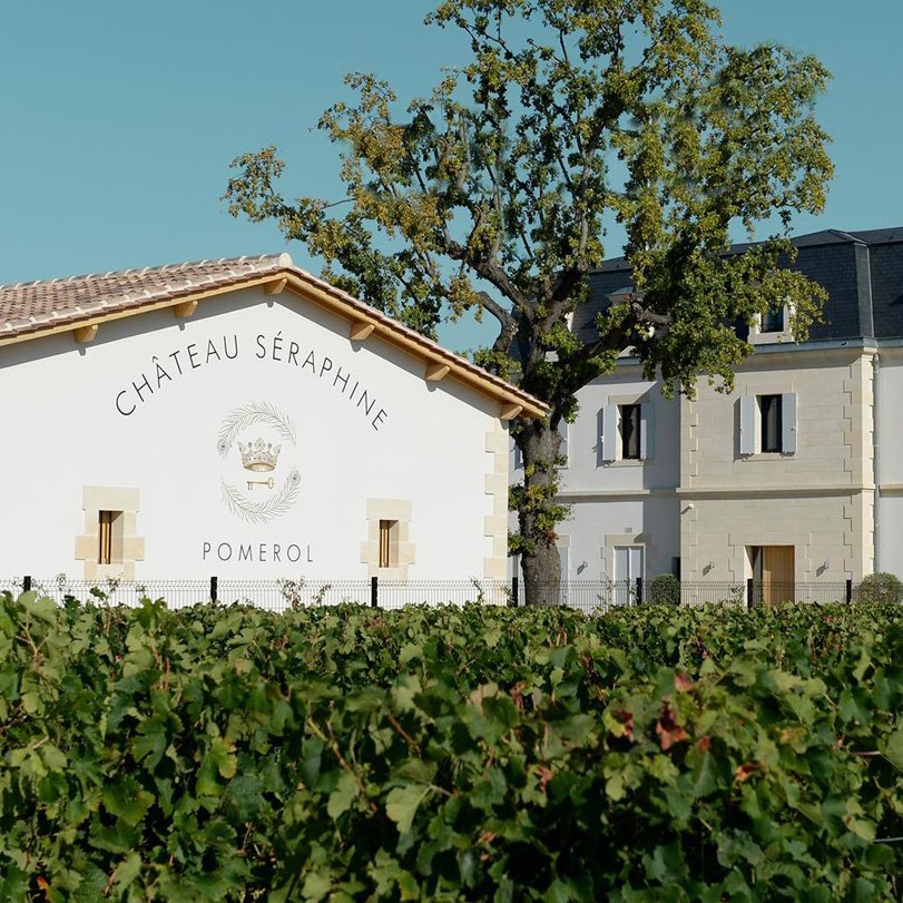
Château Séraphine is the creation of proprietor Martin Krajewski and his winemaker daughter, Charlotte.
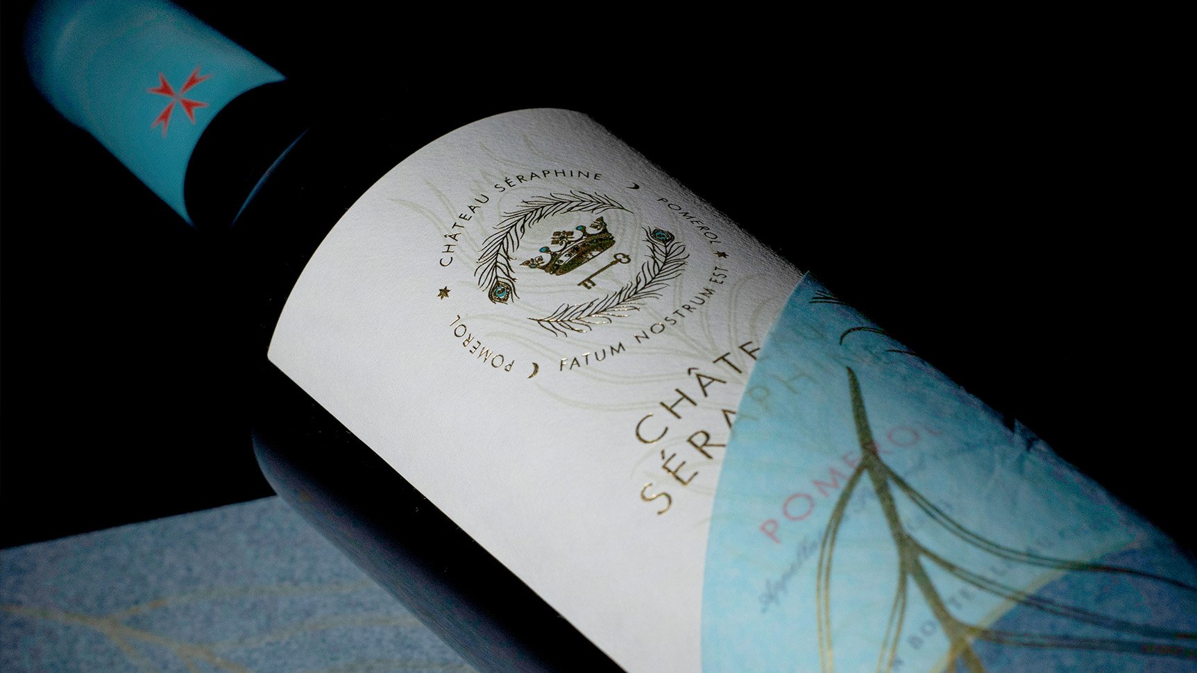
The label design for Château Séraphine encapsulates the history of the Krajewski family – Seraphine being the name of owner Martin’s grandmother, ‘elements’ of the family crest and the peacock feathers of the Polish Cavalry in which his father served.
In Pomerol, the appellation’s clay soils help retain water, and Chateau Séraphine benefits in parts from this miracle clay which helps produce great wines that are sensuous and hedonistic. When deciding on a wine label design, the brand’s eye-catching teal colour was chosen to represent the blue clay (smectite) for which Pomerol is renowned.
From capsule crest to tissue wrap, the finished branding and wine bottle design is luxurious, striking, unusual and defiant, yet classic.
“A rising star in Pomerol”
— Jane Anson, Decanter
What we did
— Creative concepts
— Wine bottle label design
— Artwork and production


-
![Tesco Finest case study]()
How we gave Tesco Finest wines a hallmark of quality across the range
-
![]()
How we journeyed off the beaten track for a new M&S range
-
![]()
How we helped The Drinks Trust create positive ripples in water
-
![]()
Proudly McGuigan, globally recognisable, unashamedly alcohol-free
-
![]()
Creating a contemporary identity for Bluebell Vineyard Estates
-
![]()
Evolving Blackwoods Gin & Vodka - spirits with a Scottish accent
-
![]()
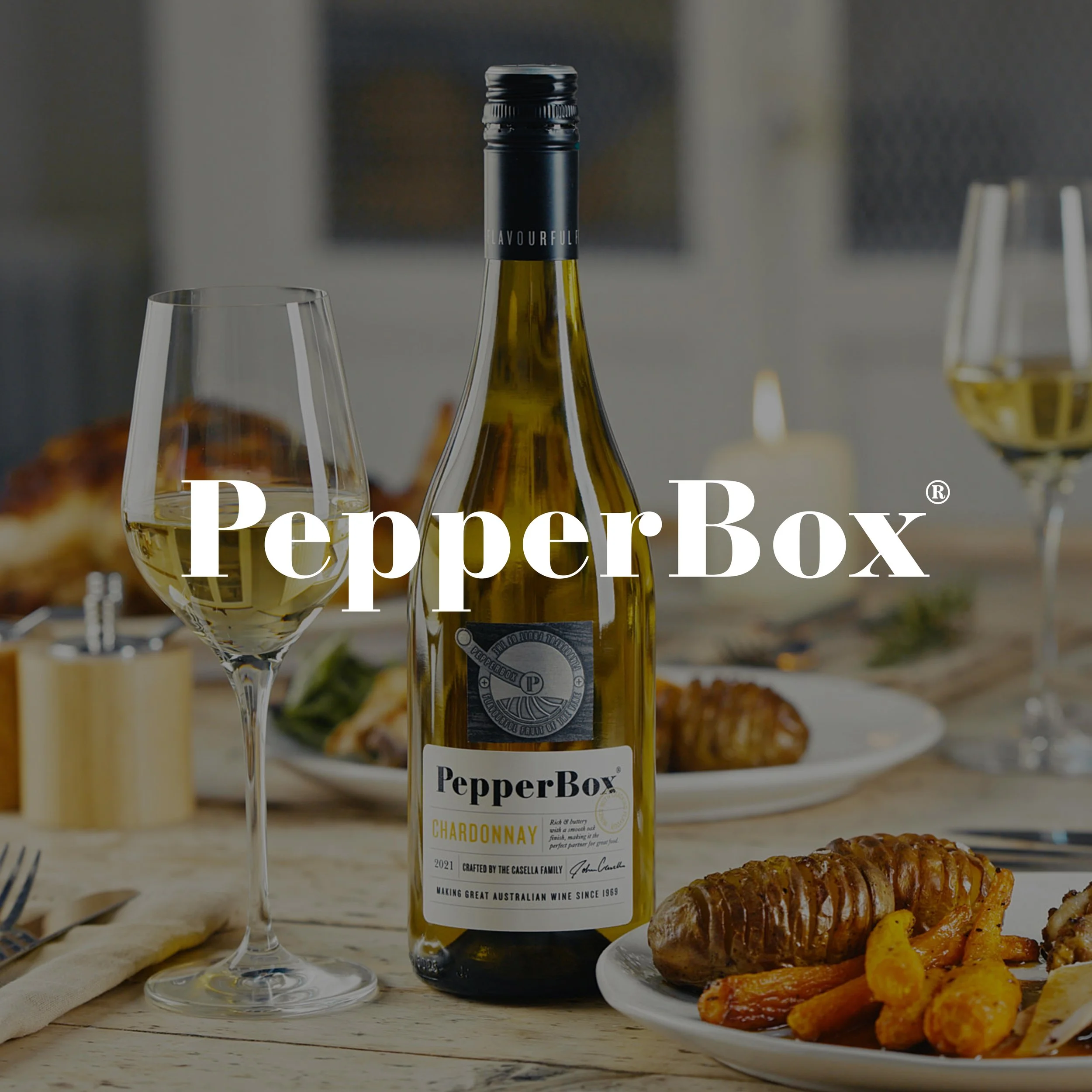
How we created a new wine brand with cracking flavour